Never Coffee
BUILDING A BRAND FROM THE GROUND UP
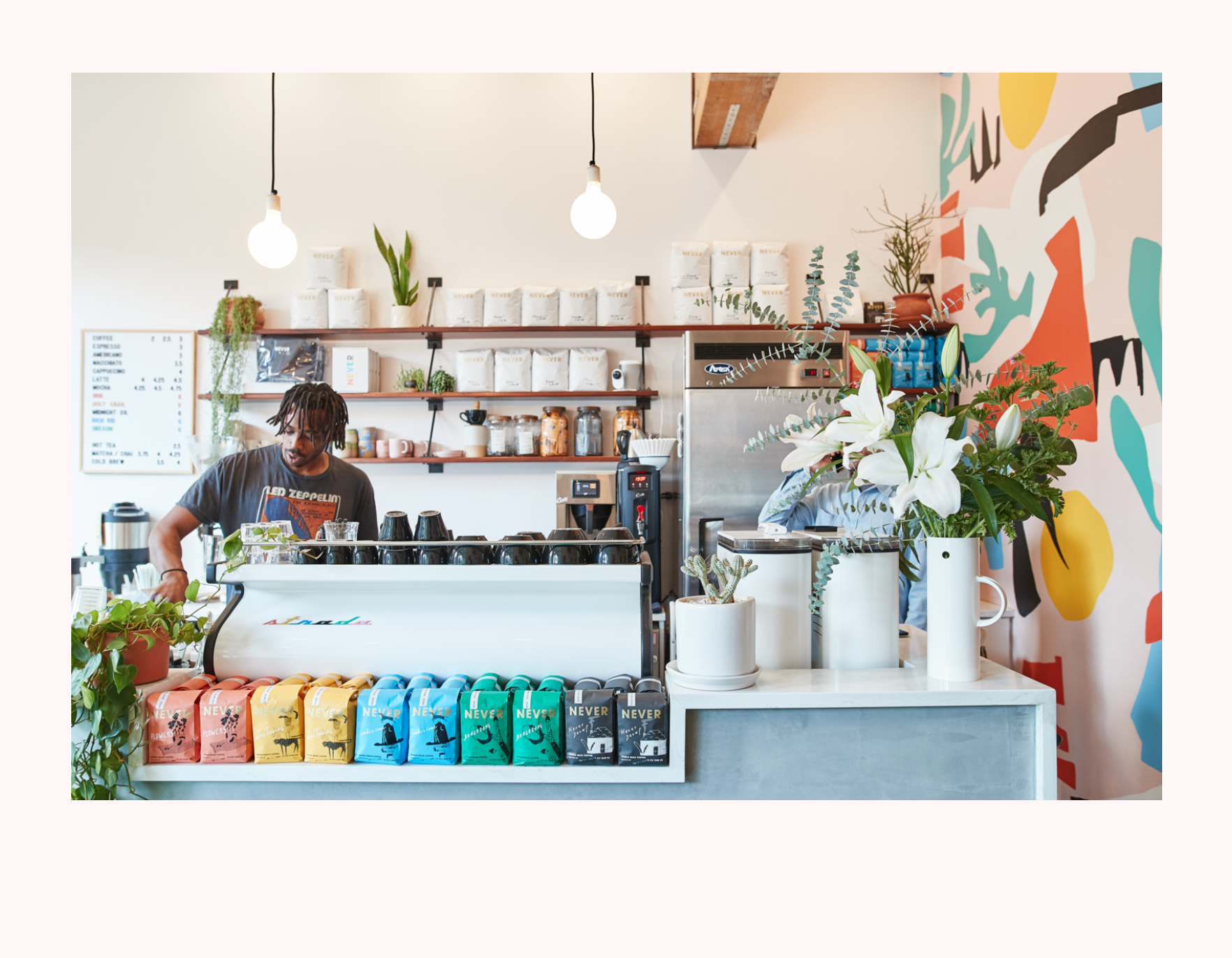
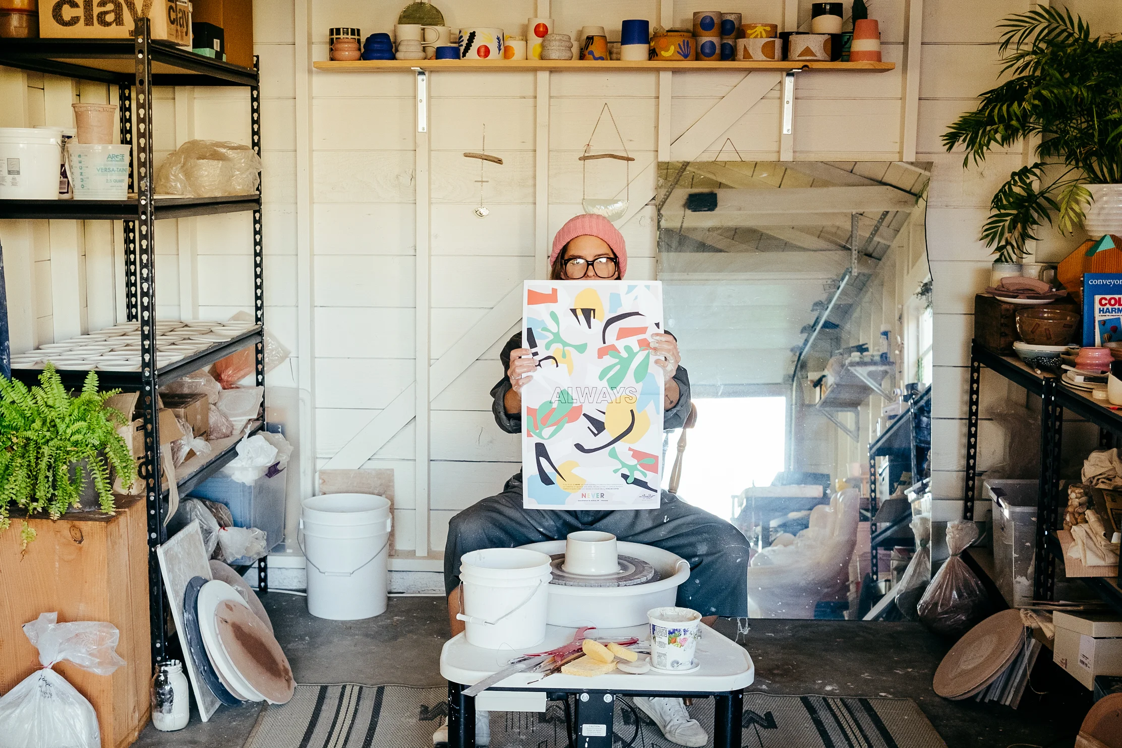
Photo by Marshal steeves
Roles fulfilled for Never Coffee
Brand Development
Creative consultant for interior design
Art direction:
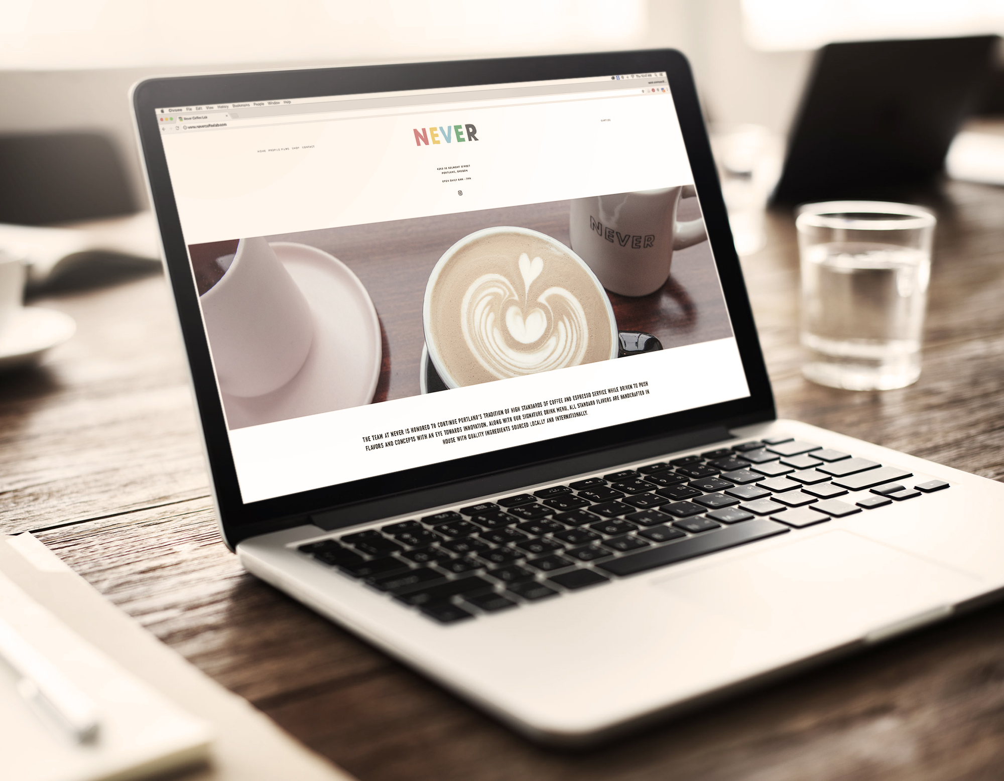
Website, Web shop, and Social Media
Product & Specialty Packaging Design and Development
Brand Visuals / Motion graphics
Copywriter
Collaborations Coordinator
Interior Design
Mural Painter
Never Painter Series Painter
THE QUESTION
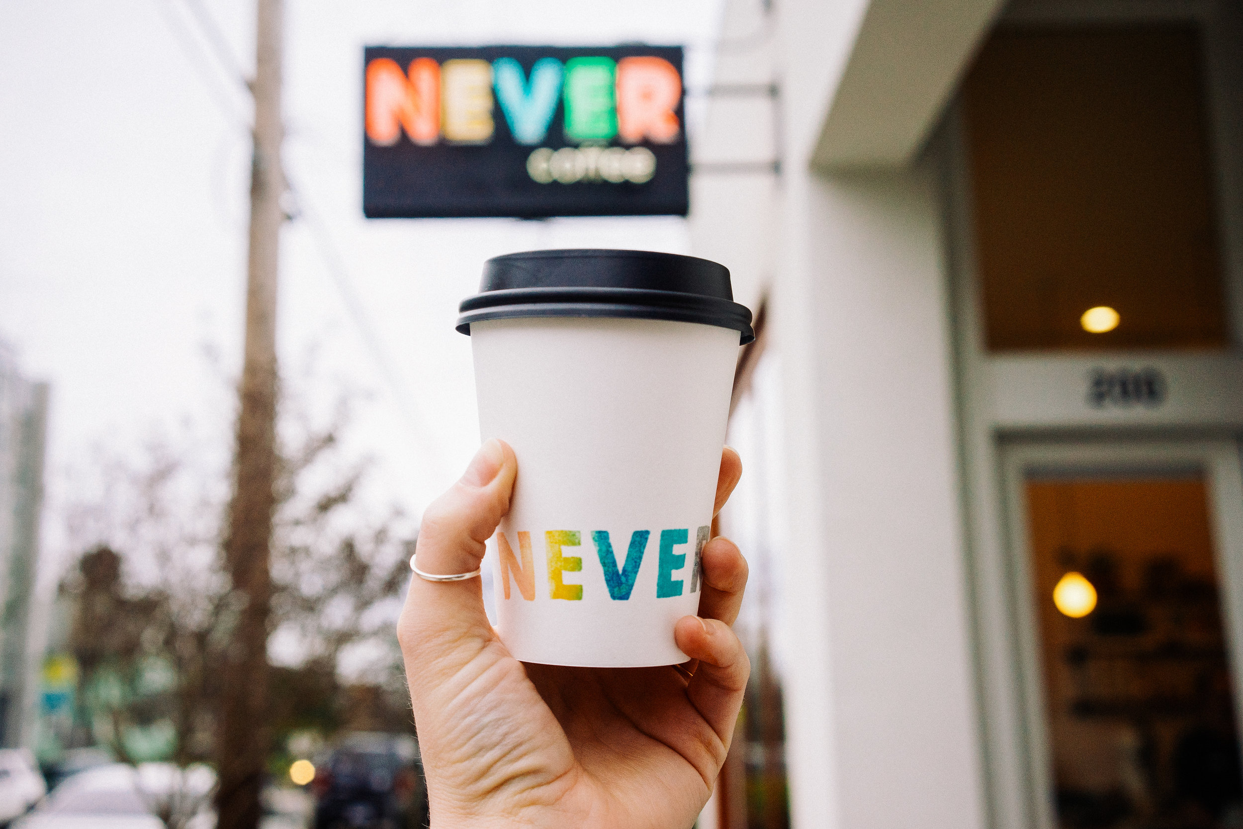
The question was obvious. How do you design a coffee shop that stands apart, steps out of line a little bit, dances to its own rhythm while still providing excellent quality drinks and service, a classy atmosphere and welcoming clean aesthetic? To the Juliet Zulu Team the answer was simple. Color. Bring color back to the coffee shop. Brighten up the cup. Let the joy in.
THE SPACE
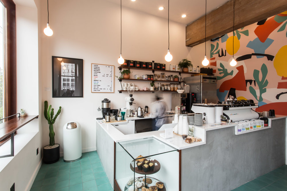
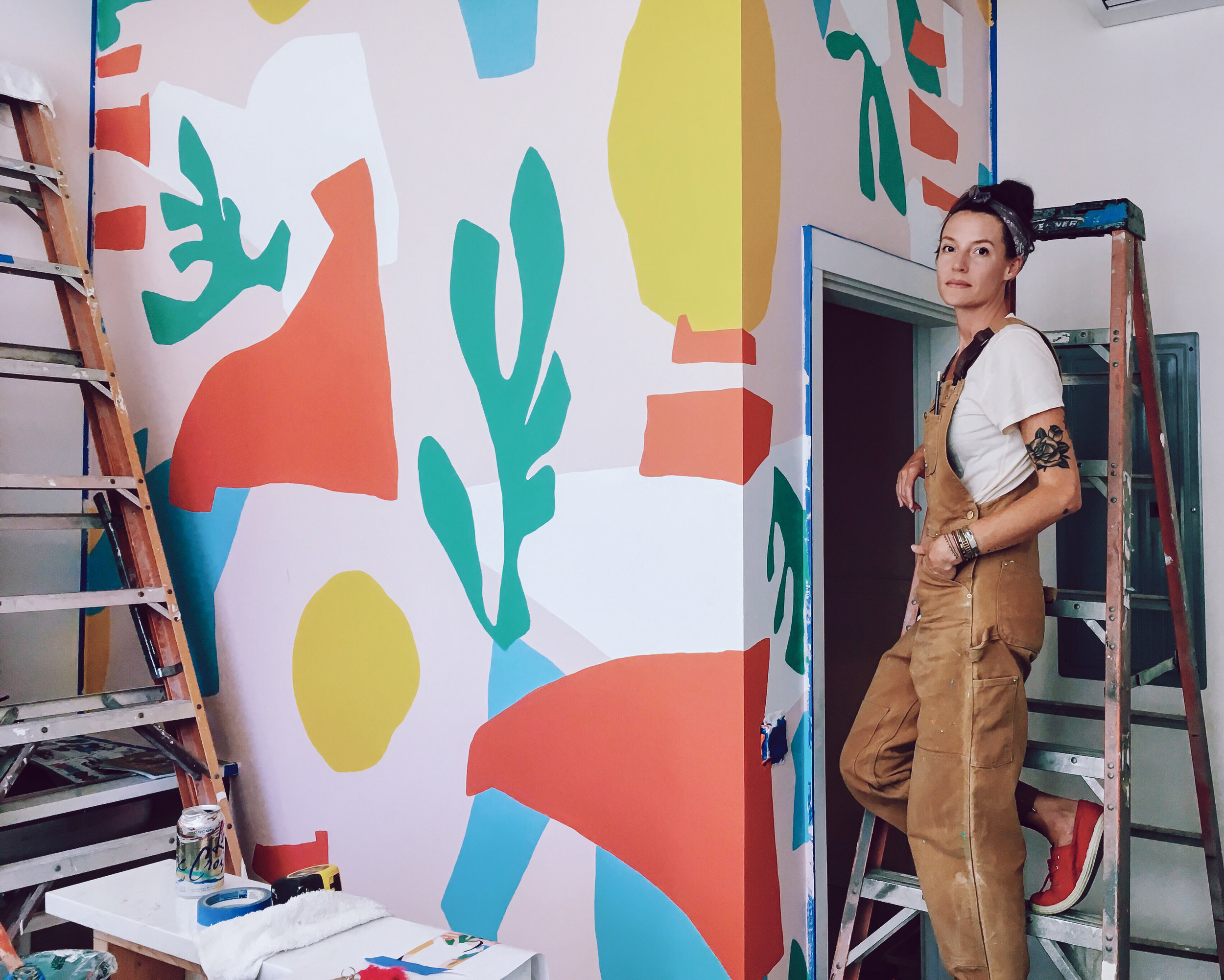
If color was the answer then shapes became the vehicle. Art Director Sarah Simmons and lead designer Grace Potts began exploring paper-cut shapes and a rich library of colors to narrow down the feeling of Never... and it is a feeling.
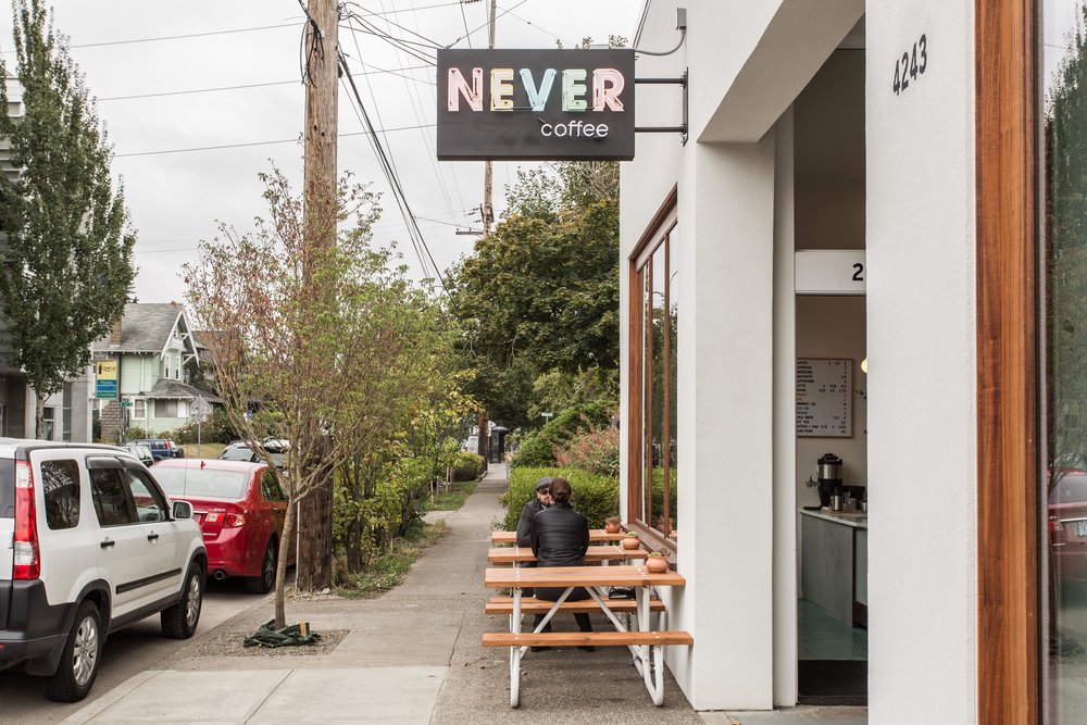
The neon sign that calls the early morning sleep walkers is just the beginning of the visual experience of Never as a space. An enticing mural painted by Simmons stands out on the back wall, while wood accents, a classic marble bar, and intriguing green tile balance out the small commuter cafe to be the perfect morning stop in.
“From logo design to web design to online shop design, nothing was left unturned. We did it all. The details matter to Never Coffee and details matter to us as makers.”
Signature Drinks
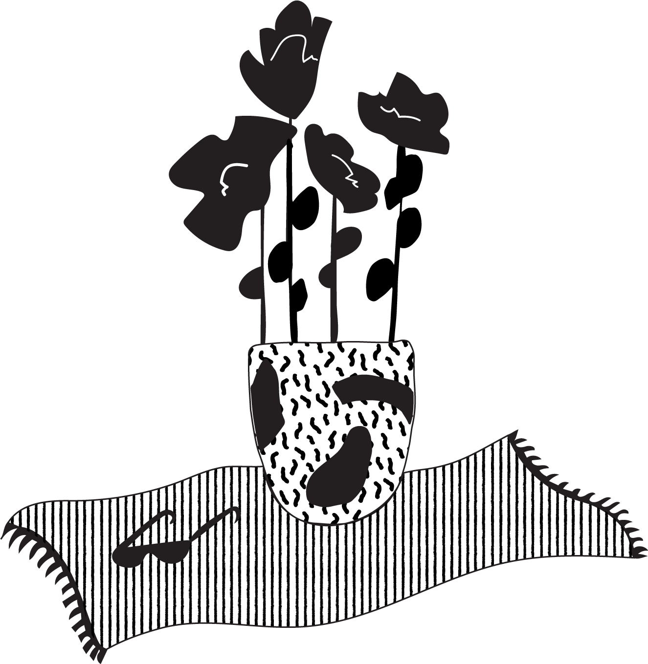
Never's signature drink game is strong and needed a system to not only describe the contents of the drink but show the character of each drink in a unique way. This launched us into starting the Painters Series - a special card painted specifically for each drink with ingredients on one side and art on the other. You can describe a taste all day long, but you can share a moment with color and line.
Product Design And Packaging
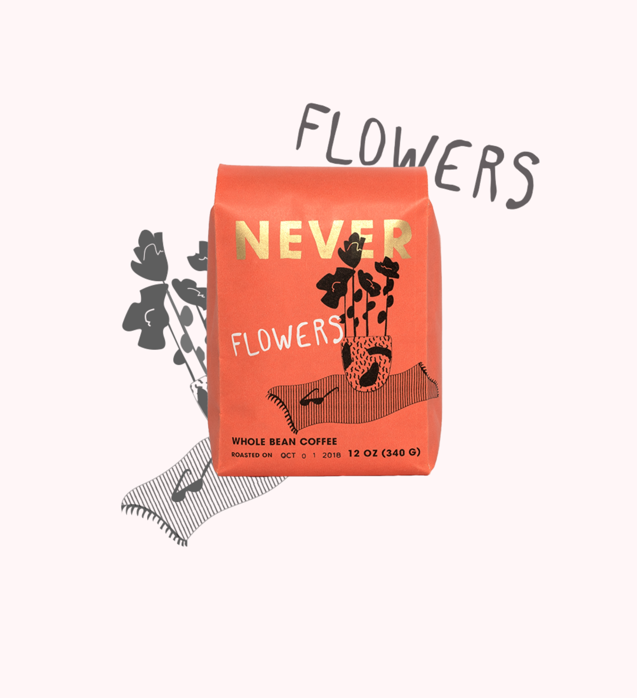
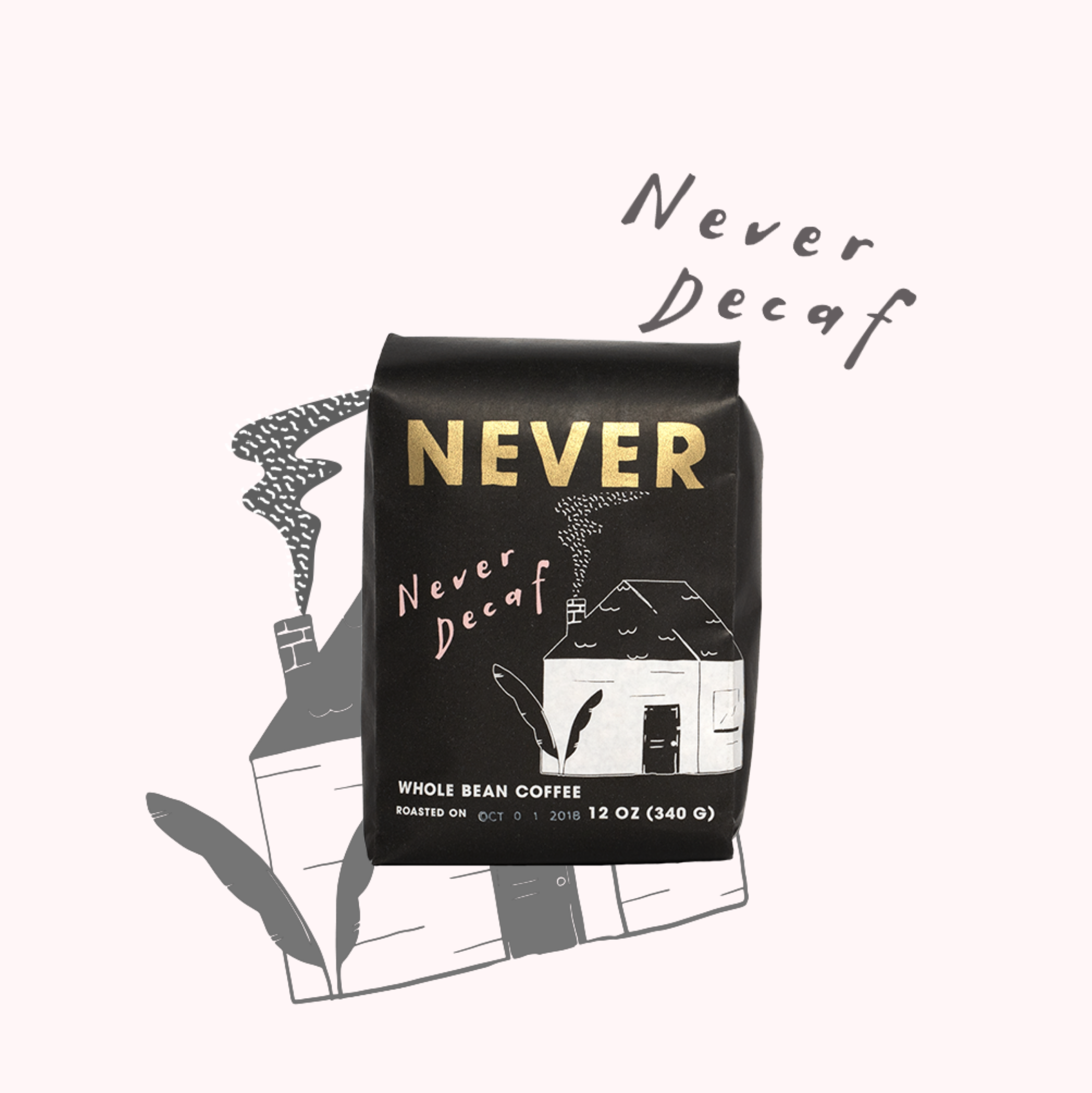
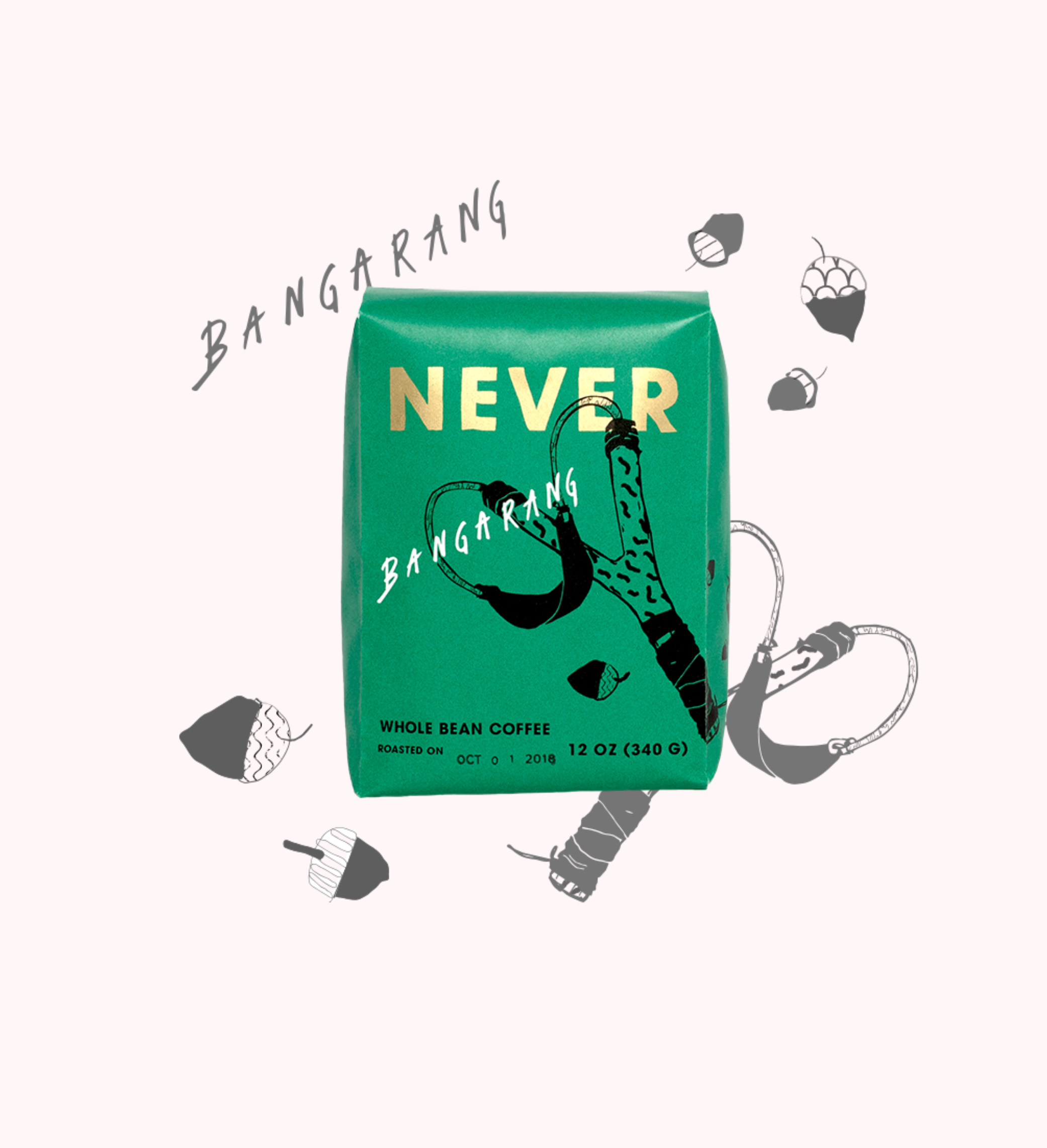
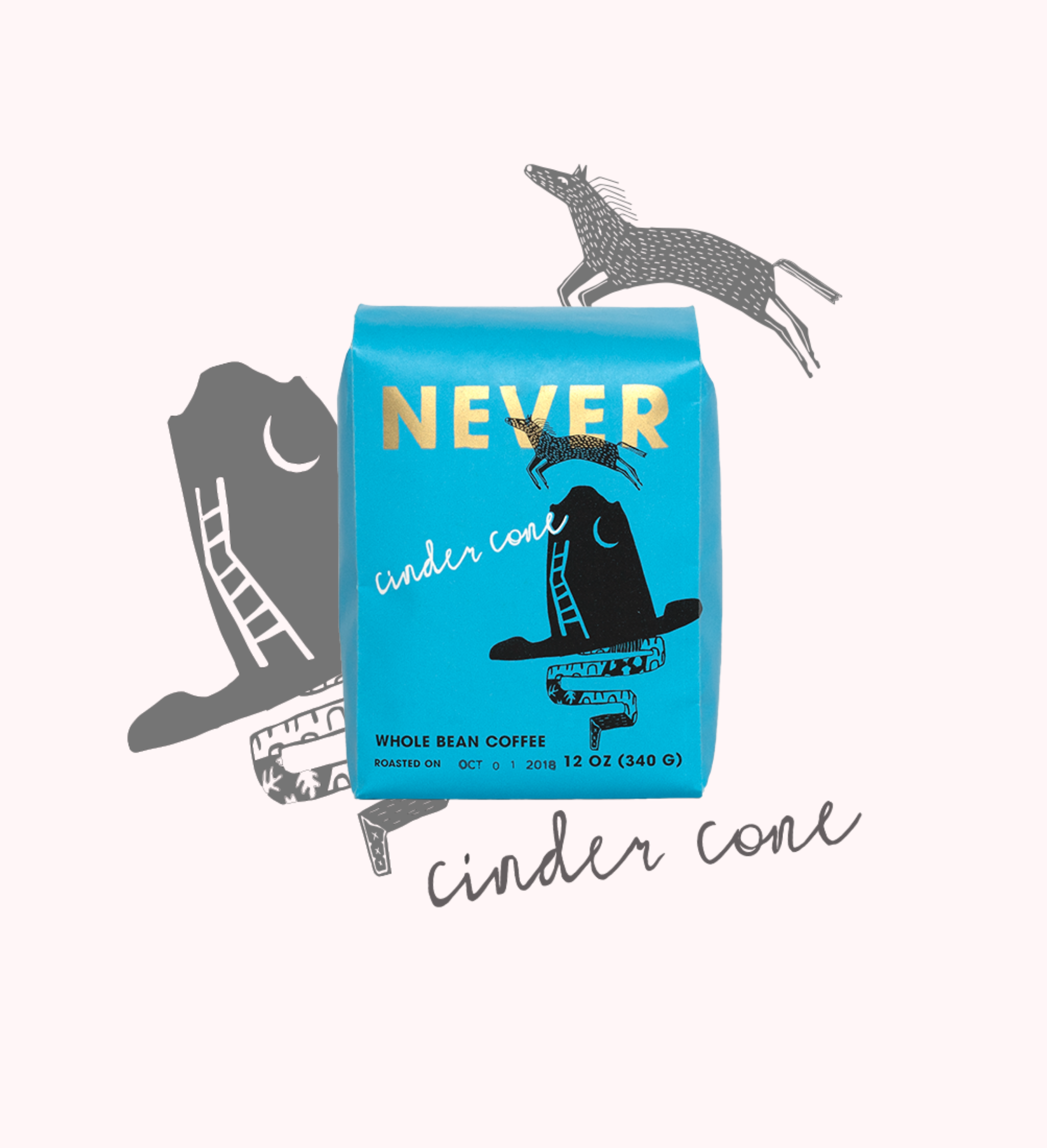
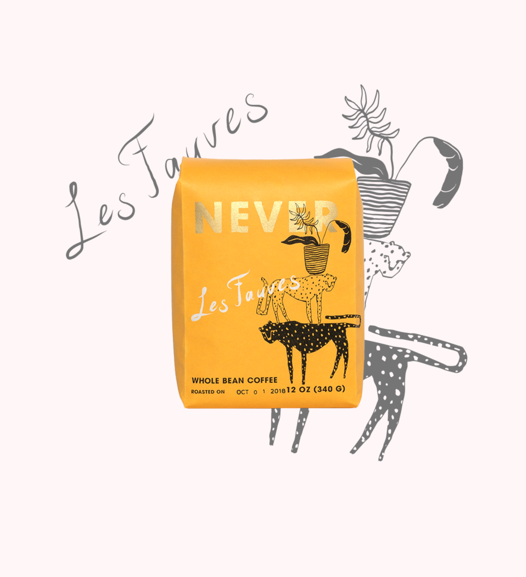
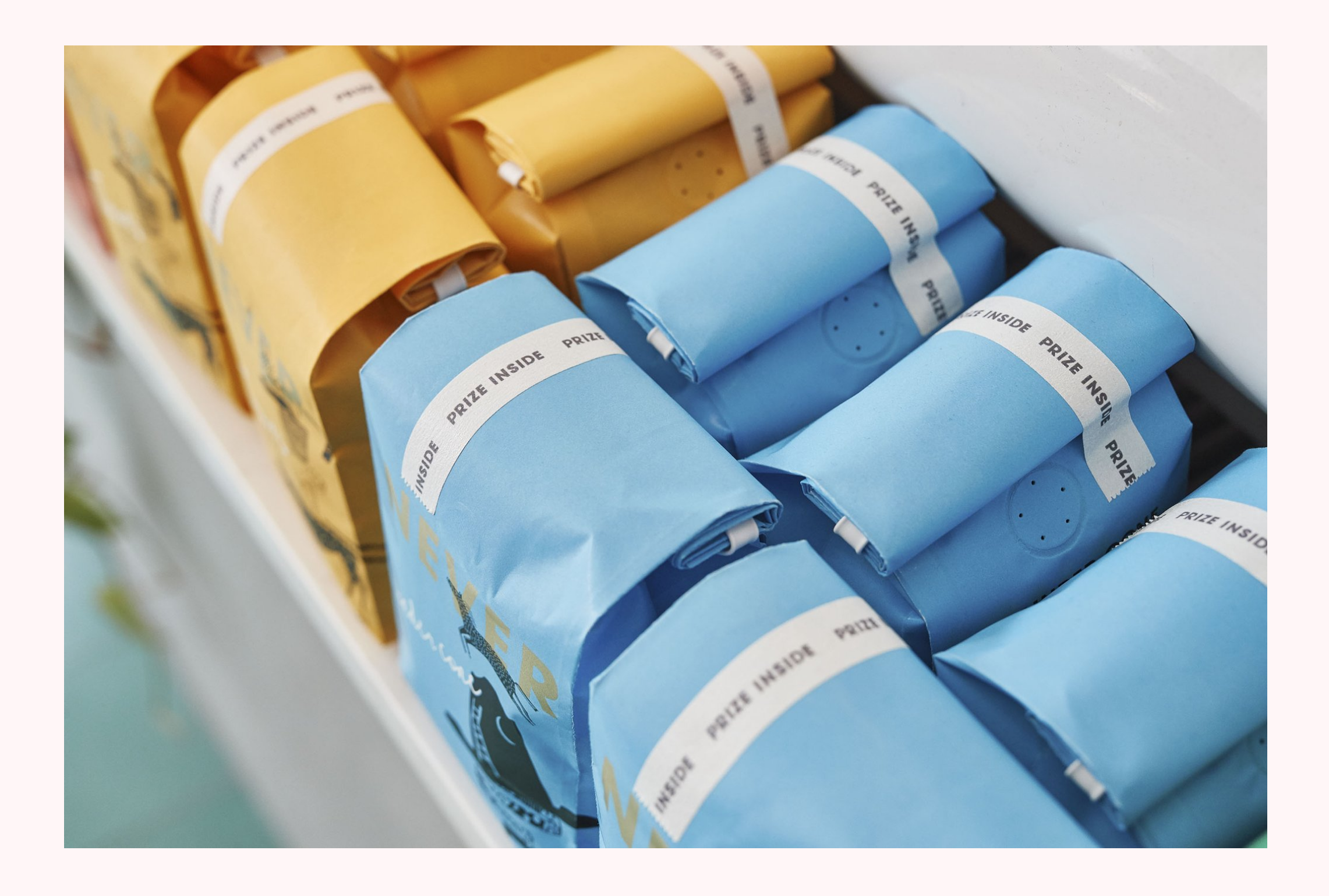
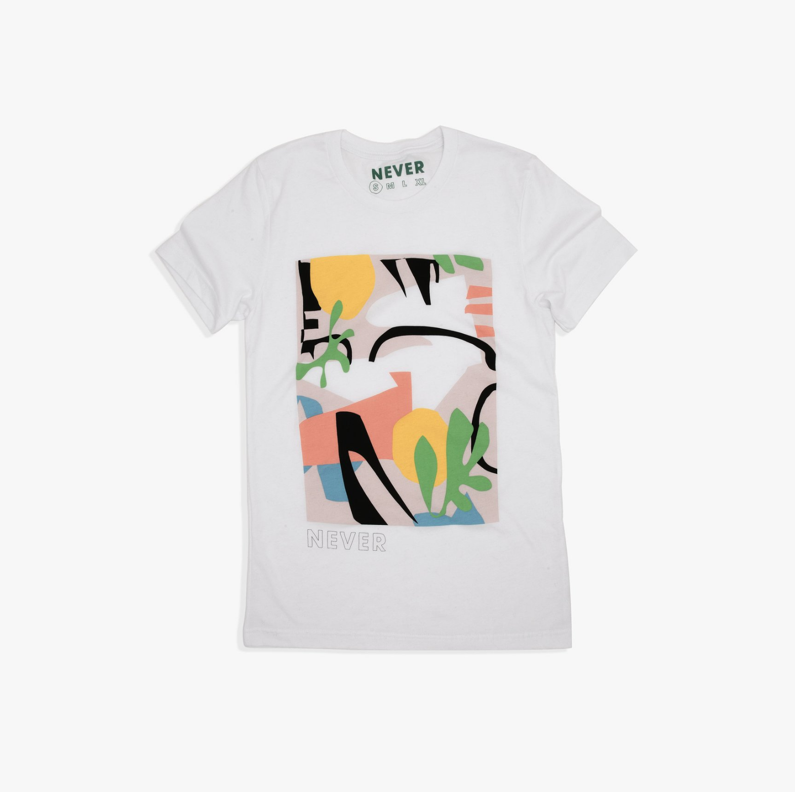
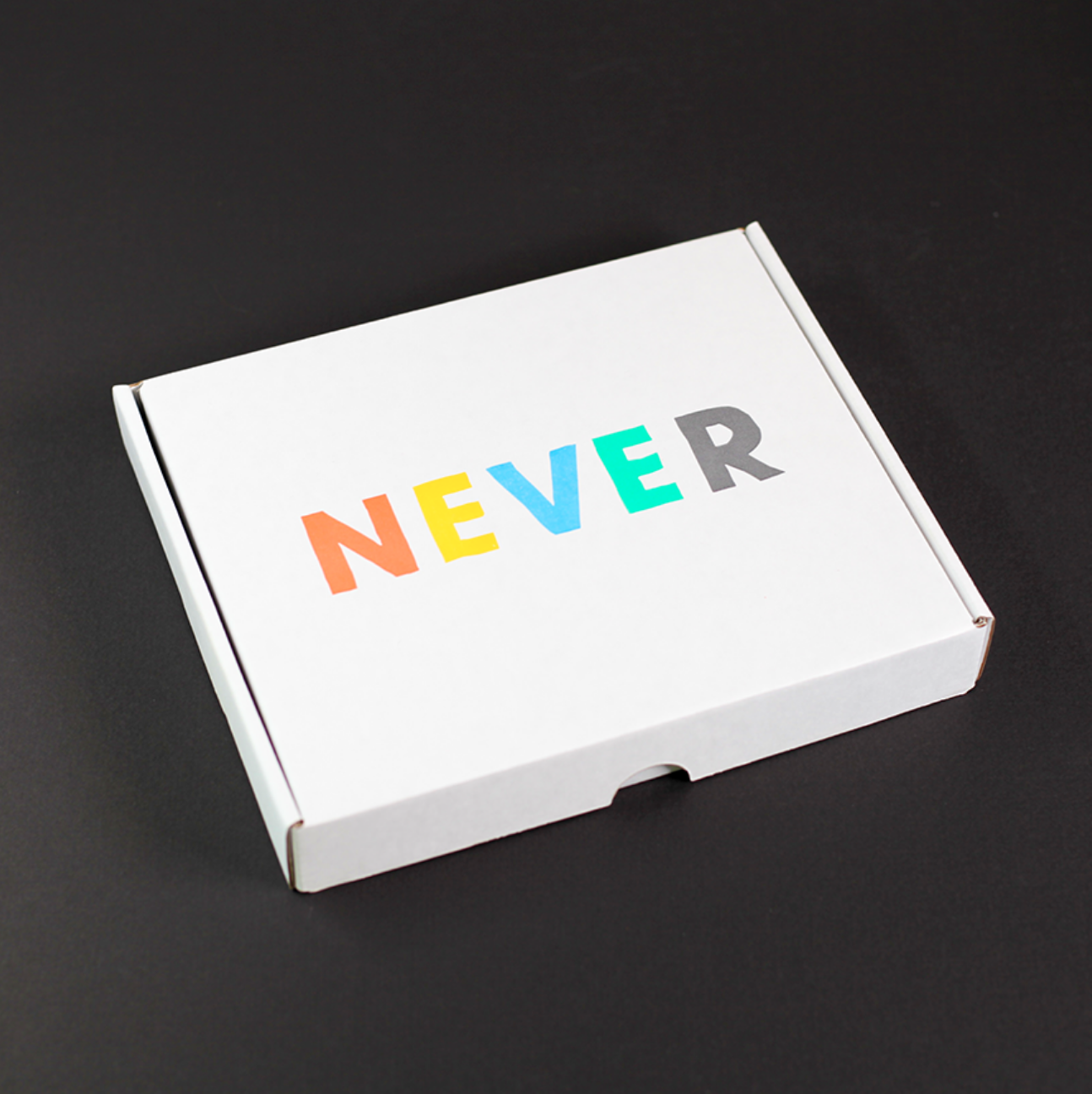
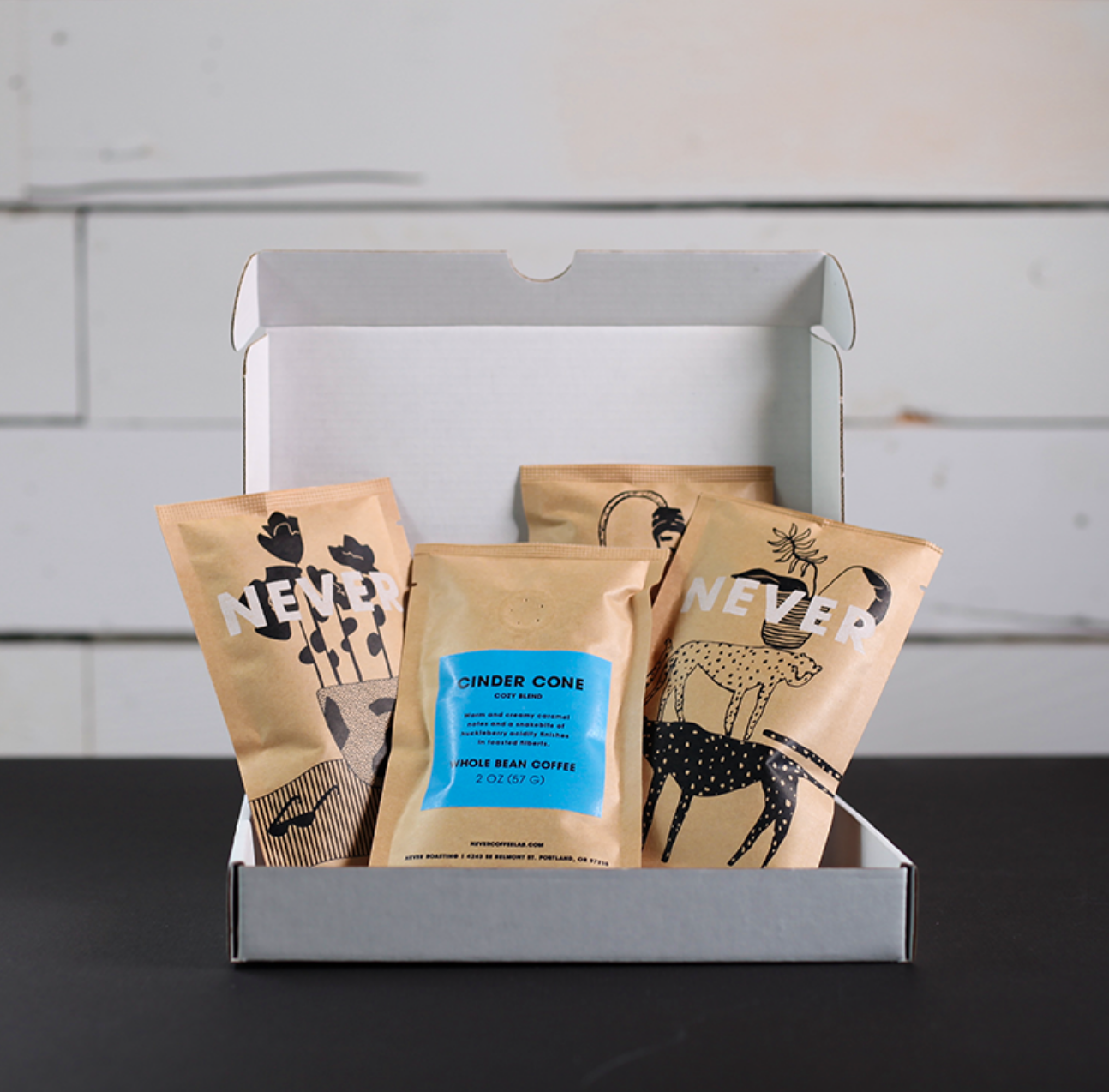
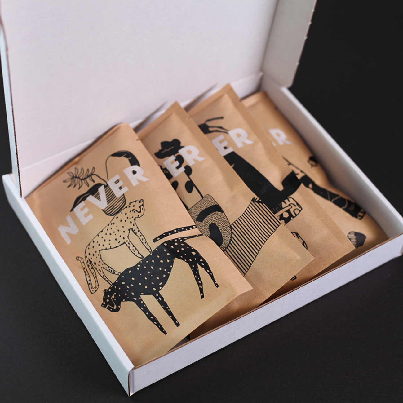
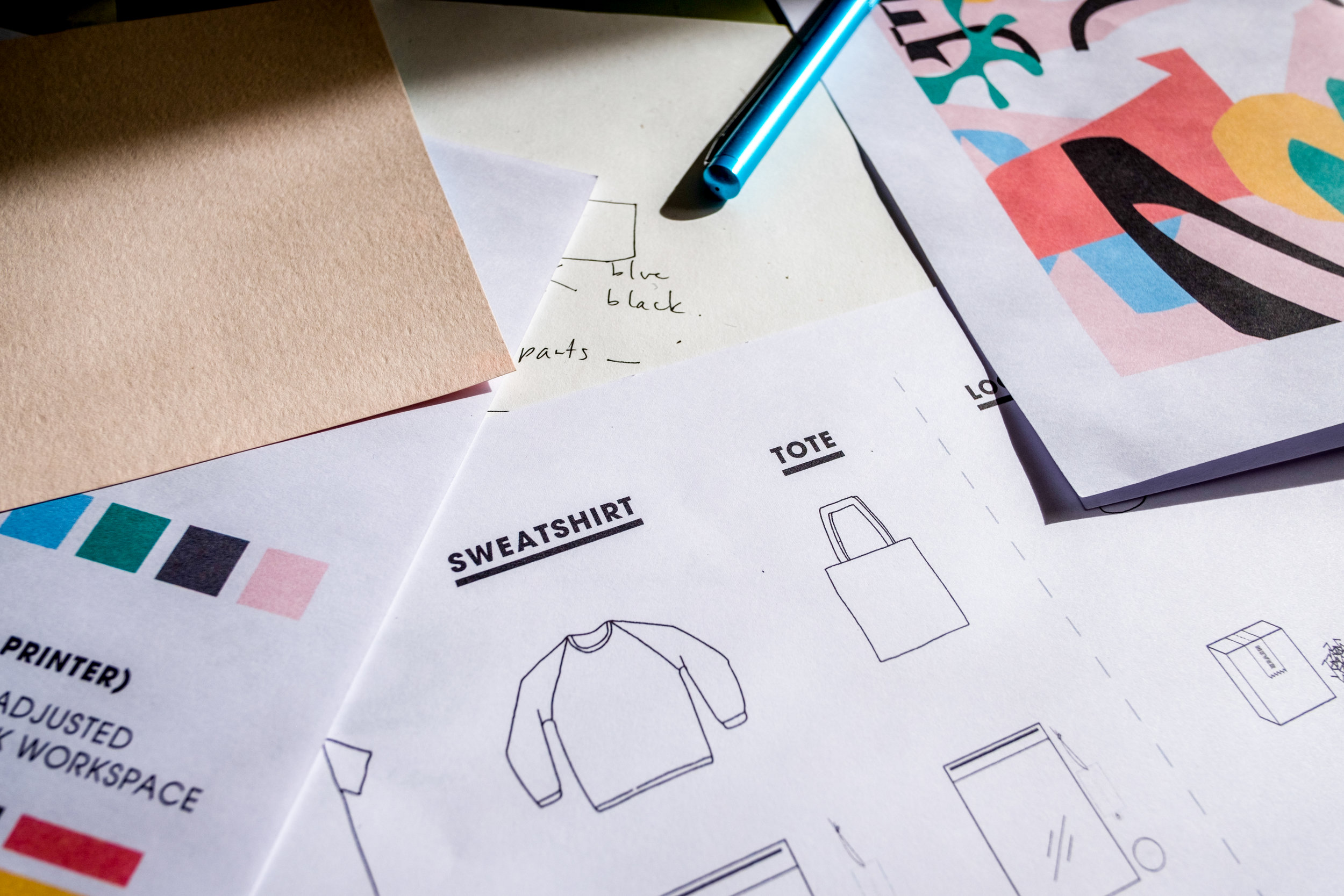
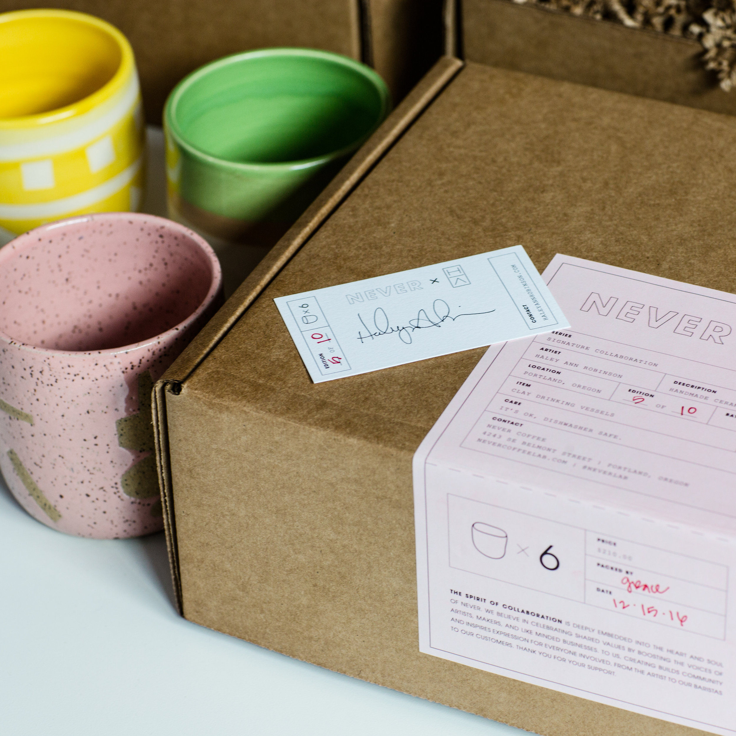
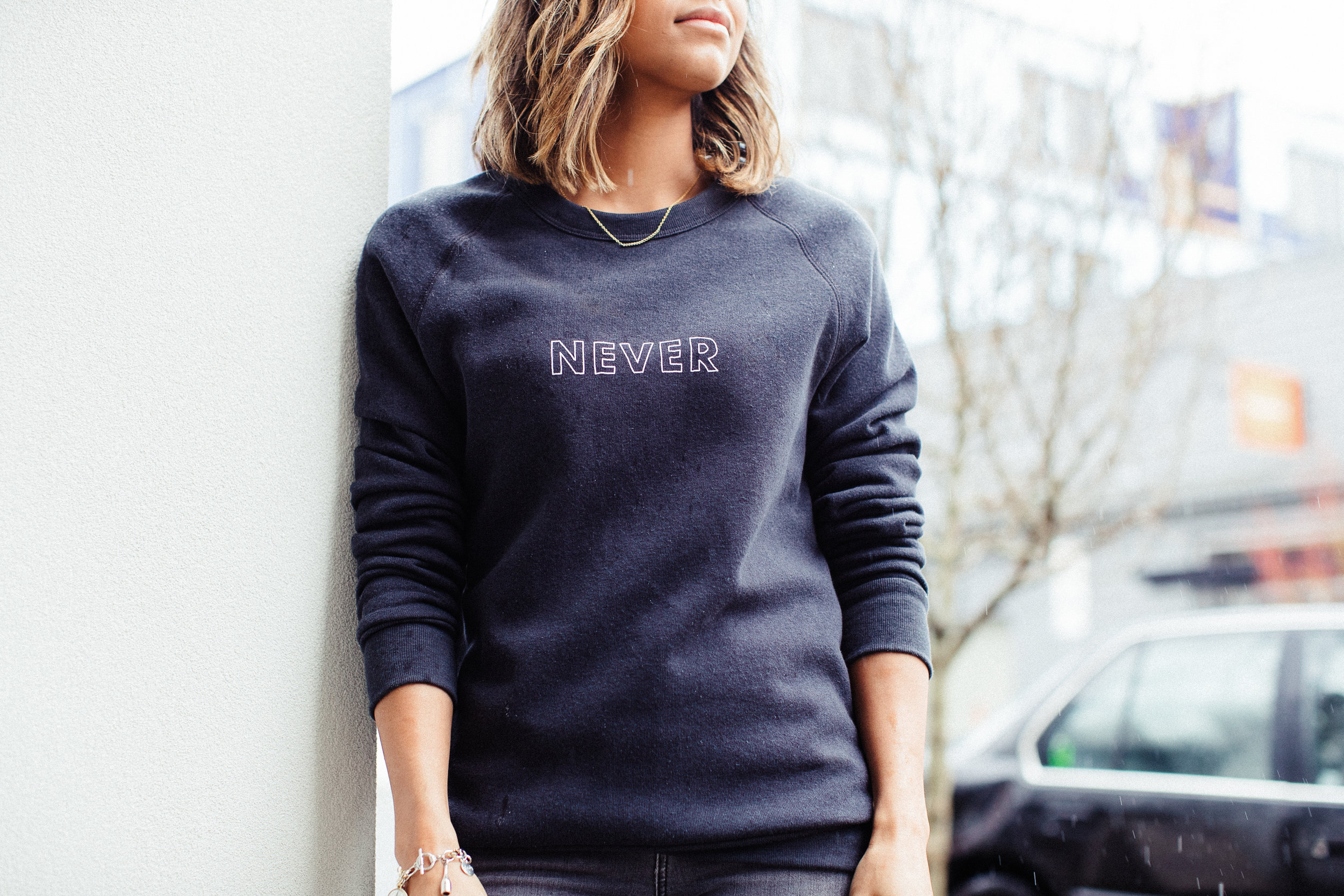
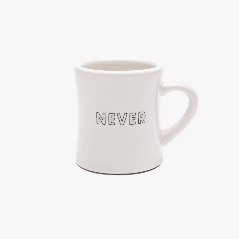
Coffee culture is a lifestyle and the products that carry the name Never had to seamlessly fit into the world we had created. Every detail was accounted for from specialty packaging for collaborations to the name brand apparel that is sold in shop and online."
*This text is an excerpt from a post I wrote on the process of branding Never Coffee for the juliet zulu journal.
